Tutorial - Data Analysis with Plotly and Pandas
Level: Beginners
Time: 20 min
Prerequisites:
- You have an account and completed the installation process. No account? Get one here
- You have some experience with reading Python code

Introduction
In this tutorial we’ll make a VIKTOR app to process, visualize and summarize data from a .csv.
We’ll do this by using two well-known Python libraries: Pandas and Plotly.
Visualizing data is one of the best ways to find trends and patterns. By plotting or grouping the data, we can quickly find these trends and make better business decisions! It is also an excellent way to present results to stakeholders like your manager or another business unit.
In this tutorial you will learn how to:
- Create an empty app template
- Extract the data from a .csv
- Add input fields
- Plot the data using Plotly
- Add a data summary
By the end of this tutorial you will be able to create a colorful chart that can be used for analysis and saved for reports to help explain data. You will understand how to automate the process in VIKTOR and it will look similar to the gif below:
1. Create app folder
Is your app code giving you an error? Take a look at the complete app code.
Also know that you can always ask help at our Community Forum, where our developer are ready to help with any question related to the installation, coding and more.
When developing app, you store the code on your hard drive. So let's create some folders to store the code.
-
If you haven't yet, create a folder called
viktor-appsto store all your apps. Let's do this inside your user folder, like shown here:C:\Users\<username>\viktor-appsLINUX
Are you a Linux user? Then make sure the CLI has full rights in the apps directory, by changing its permissions with:
sudo chmod -R 777 ~/viktor-apps -
Inside
viktor-apps, make another folder calleddata-analysis-tutorialfor this project:C:\Users\<username>\viktor-apps\data-analysis-tutorial
2. Create, install and start an empty app
Let's now create, install and start a blank app template. We will use the blank template to create our data analysis app.
But before we start, make sure to shut down any app that is running (like the demo app) by closing the command-line shell
(for example Powershell) or cancel the process using Ctrl + C.
Follow these steps to create, install and start a blank app template:
-
Open your preferred code editor (e.g. PyCharm, VS Code, etc.).
-
Click File -> Open, and open the folder
data-analysis-tutorialwe created before as a new project. -
Inside your code editor, open the terminal. The keyboard shortcut to open a terminal in PyCharm is
Alt + F12and in VS CodeCtrl+Shift+` -
In the terminal, use the command shown below to create empty app template files inside the folder
data-analysis-tutorialviktor-cli create-app --app-type editor -
We want to use Pandas and Plotly in this app. Open
requirements.txtand addplotlyandpandasunder yourviktorversion (don't change that line):viktor==X.X.X <-- Don't modify this line
plotly
pandas -
Now we'll install your app and all its dependencies (including
plotlyandpandas) by running this command in the terminal. Just be a patient, this could take up to 5 minutes... Maybe it's time for a ☕?viktor-cli clean-startIf all went well, your empty app is installed and running one your development workspace. Do not close the terminal as this will break the connection with your app.
You can see your app which you can see by visiting the URL shown in the terminal (for example https://cloud.viktor.ai)
Your terminal should show something like this:
 INFO     : Connecting to platform...
 INFO     : Connection is established: https://cloud.viktor.ai  <---- here you can see your app
 INFO     : The connection can be closed using Ctrl+C
 INFO     : App is ready
- You only need create an app template and install it once for each new app you want to make.
- The app will update automatically once you start adding code in
app.py, as long as you don't close the terminal or your code editor. - Did you close your code editor? Use
viktor-cli startto start the app again. No need to install, clear, etc.
Did it not work because you got an error messages?
Some troubleshooting
-
Always make sure to check the spelling of everything you placed in the command-line, a small mistake and the command you are trying to run may not be recognised!
-
If you are encountering:
ERROR:
  Exiting because of an error: no requirements.txt file
PS C:\Users\<username>\viktor-apps>
Then you are not in the correct folder! check the command-line and navigate to the data-analysis-tutorial folder.
-
If you are encountering:
Error: App definition is not compatible with the data currently stored in the database. Use the command 'viktor-cli clear' to clear the database.
PS C:\Users\<username>\viktor-apps\data-analysis-tutorial>
That means you have not cleared the database yet! Use the
viktor-cli clearto clear and then you can useviktor-cli startto start the app. No need to install it again!
Not seeing any of these errors? Head over to our community! There is a good chance another developer encountered it and solved it too!
2. Extract data from .csv
For this tutorial, we will dive into a dataset that contains the car sales data of a showroom.
The CEO has asked you to create a tool so that they can compare which type of cars were sold. He did not specify what he wanted to compare so we will make this tool so that we compare any two properties of the sold cars as well as give some additional data/information that might be interesting.
-
Download the dataset here.
-
Make sure the file name is
car-sales.csv -
Add the file to your app folder (
data-analysis-tutorial) -
We'll create the function
extract_datato access the data using Pandas, and add all the necessary imports so that we don't need to do this later. Openapp.pyand make sure the first part of the code looks like this:from pathlib import Path
import pandas as pd
import plotly.graph_objects as go
from viktor import ViktorController
from viktor.parametrization import ViktorParametrization, OptionField, Text
from viktor.views import PlotlyResult, PlotlyView, PlotlyAndDataResult, PlotlyAndDataView, DataGroup, DataItem
def extract_data():
parent_folder = Path(__file__).parent
file_path = parent_folder/"car-sales.csv"
data = pd.read_csv(file_path, sep=';')
return data
class Parametrization(ViktorParametrization): # <--- this line is for your reference
3. Add Input fields
We want the CEO to interact with the app. For this, we will add two OptionFields.
One to determine the variable on the X-axis and the other for the Y-axis. Also, we will make sure that the showed options
correspond to the columns of the data set.
Remember, we always add input fields in the Parametrization class.
-
In the
app.pyfile make sure the code in theParametrizationclass looks like this:...
class Parametrization(ViktorParametrization):
introduction = Text(
"""
# 📊 Data Analysis App!
In this app you can summarise data and visualise it in a PlotlyView.
The app will summarise some data in the DataView and allow the user to choose a column to analyse to create the Plotly chart.
"""
)
# Add some input field for the user
main_column = OptionField('Choose main property', options=extract_data().columns.values.tolist())
count_column = OptionField('Choose property to analyse', options=extract_data().columns.values.tolist())
class Controller(ViktorController): # <--- this line is for your reference -
Go to your cloud environment (e.g. cloud.viktor.ai) and open the development card. Great! You will be able to see your input fields.
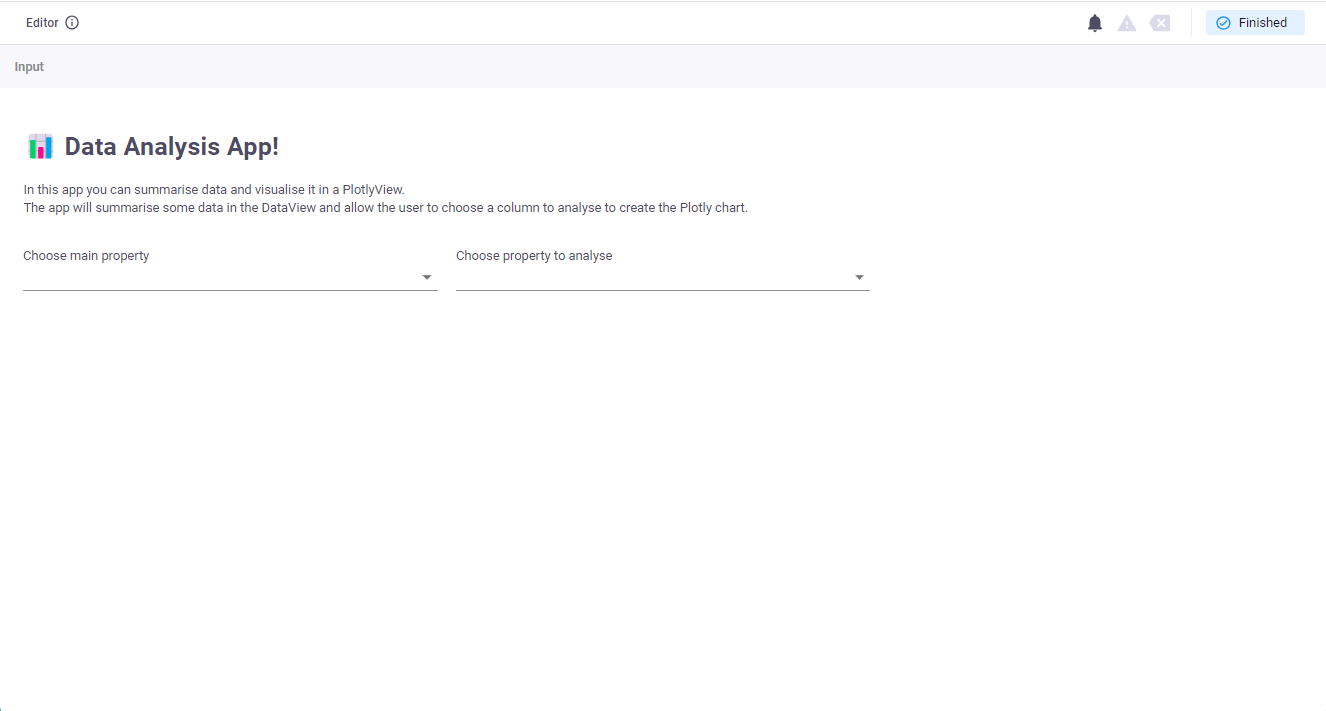 How the app should look after the parametrization
4. Plot the data
Now, we'll make a bar chart to show the data. We will create the plot using Plotly, which is a well known plotting library.
In VIKTOR, we show Plotly graphs in a PlotlyView.
We'll use the function extract_data to extract the data form the .csv, and Pandas to process it.
Remember, we allways add views in our Controller class.
-
In
app.py, find theControllerclass and make it look like this:class Controller(ViktorController):
label = 'My Data Analysis App'
parametrization = Parametrization
@PlotlyView('Bar chart', duration_guess=1)
def generate_plotly_view(self, params, **kwargs):
# Extract and edit data to make it easy to plot
data = extract_data()
edited_data = data.groupby(params.main_column)[params.count_column].value_counts().unstack().fillna(0)
# Make the bar chart
fig = go.Figure()
for column in edited_data.columns:
fig.add_trace(go.Bar(x=edited_data.index, y=edited_data[column], name=column))
# Edit the bar chart
fig.update_layout(barmode='stack',xaxis_title=params.main_column,yaxis_title='Amount Sold')
return PlotlyResult(fig.to_json()) -
Refresh your app. Nice! You should now see a beautiful stacked bar chart of the data after you fill in the inputs. What you will also notice is that when you hover the mouse over one of the bars, Plotly will tell you the exact amount of cars with those two properties!
 The app is almost finished! It should look similar to this
5. Add a data summary
Fantastic, we have a fully functioning app 🎉. But that doesn't mean we cannot make it better.
Let's now add a summary with the most important data next to our graph. We'll show the total number of cars sold and the selected column's best-performing and least-performing property.
Thanks to Pandas, we can easily compute the totals per column and find the highest and lowest value with just a single line
per value. For this, we need to modify the generate_plotly_view method.
Here are the required steps. The code is below.
-
Replace the
@PlotlyViewin your code for a@PlotlyAndDataView, so we can also display data next to the plot. -
Make sure you return a
PlotlyAndDataResultwith the plot and theDatagroup
Here is the code for your reference:
...

class Controller(ViktorController):
    label = 'My Data Science App'
    parametrization = Parametrization

    @PlotlyAndDataView('Bar chart', duration_guess=1)   # <--- Change the PlotlyView to PlotlyAndDataView
    def generate_plotly_view(self, params, **kwargs):

        # Extract and edit data to make it easy to plot
        data = extract_data()
        edited_data = data.groupby(params.main_column)[params.count_column].value_counts().unstack().fillna(0)

        # Make the bar chart
        fig = go.Figure()
        for column in edited_data.columns:
            fig.add_trace(go.Bar(x=edited_data.index, y=edited_data[column], name=column))

        # Edit the bar chart
        fig.update_layout(barmode='stack', xaxis_title=params.main_column, yaxis_title='Amount Sold')

        # Create a summary with the data                                 # <--- add this line
        summary = DataGroup(                                             # <--- add this line
            DataItem("Total Sold" , len(data)),                          # <--- add this line
            DataItem("Most Occurring", edited_data.sum().idxmax()),      # <--- add this line
            DataItem("Least Occurring", edited_data.sum().idxmin()),     # <--- add this line
        )

        return PlotlyAndDataResult(fig.to_json(), summary)  # <--- Modify this line (PlotlyResult to PlotlyAndDataResult)
Refresh your app. You can now see the data on the right of the chart, and you can hide it using the arrow so you can focus on the bar chart!
Now select the 'Make' as main property and 'body-style' to analyse and try to find the best selling convertible and best selling car! You should find that the Alfa-Romero Convertible is the best selling Convertible and that the Toyota Hatchbacks are the overall best selling automobile!
Can you also find the amount of cars with a diesel powered turbo engine? Which type of engine and fuel combination are your best seller?
By now, your app should look like this:
 The app should now look like this
Complete code
Were you able to do everything in this tutorial without error? If not, you can always look at the full code:
Complete code
from pathlib import Path

import pandas as pd
import plotly.graph_objects as go

from viktor import ViktorController
from viktor.parametrization import ViktorParametrization, OptionField, Text
from viktor.views import PlotlyResult, PlotlyView, PlotlyAndDataResult, PlotlyAndDataView, DataGroup, DataItem


def extract_data():
    parent_folder = Path(__file__).parent
    file_path = parent_folder / "car-sales.csv"
    data = pd.read_csv(file_path, sep=';')
    return data


class Parametrization(ViktorParametrization):
    introduction = Text(
        """
# 📊 Data Analysis App!

In this app you can summarise data and visualise it in a PlotlyView.
The app will summarise some data in the DataView and allow the user to choose a column to analyse to create the Plotly chart.

        """
    )
    # Add some input field for the user

    main_column = OptionField('Choose main property', options=extract_data().columns.values.tolist())
    count_column = OptionField('Choose property to analyse', options=extract_data().columns.values.tolist())


class Controller(ViktorController):
    label = 'My Data Analysis App'
    parametrization = Parametrization

    @PlotlyAndDataView('Bar chart', duration_guess=1)
    def generate_plotly_view(self, params, **kwargs):

        # Extract and edit data to make it easy to plot
        data = extract_data()
        edited_data = data.groupby(params.main_column)[params.count_column].value_counts().unstack().fillna(0)

        # Make the bar chart
        fig = go.Figure()
        for column in edited_data.columns:
            fig.add_trace(go.Bar(x=edited_data.index, y=edited_data[column], name=column))

        # Edit the bar chart
        fig.update_layout(barmode='stack', xaxis_title=params.main_column, yaxis_title='Amount Sold')

        # Create a summary with the data
        summary = DataGroup(
            DataItem("Total Sold" , len(data)),
            DataItem("Most Occurring", edited_data.sum().idxmax()),
            DataItem("Least Occurring", edited_data.sum().idxmin()),
        )

        return PlotlyAndDataResult(fig.to_json(), summary)
Want to learn how VIKTOR works?
If you are interested in how VIKTOR works behind the scenes, for example how it processes your input, expand the tabs below!
How does it work?
How does the Parametrization work?
In the Parameterization class you can add input fields that allow the user to provide input to your app, and there are more than 20 different input fields you can use, including numbers, text, colors, images and files.
Inside the Parametrization class, you can also format the layout of your app by adding sections, tabs, steps and pages.
To show your Parametrization in the app, we need to add the line parametrization = Parametrization inside the
Controller class, because it is the controller that determines what is shown and not.
How does the Parametrization get saved?
So you may be wondering, how do you get the information from the parametrization to my controller?
Well, we do this automatically for you. The values of all parameters are stored in a single variable called params
, which is accessible inside the Controller class.
These variables are stored in a Munch; this is similar to a dictionary, but work with point denotation.
Example:
- Let's say we have a variable called
heightas a NumberField in ourParameterization. - To use it in a method in the
Controller, define it as:def my_method(self, params, **kwargs) - You can now make calculations inside that method using our height parameter as
params.height!
How does the Controller work?
The Controller class is the place where you add everything you want to calculate and show.
As explained in this tutorial, we show results in a View and we always add views in our controller.
You can even add several views in a single app by adding them to the controller class... and yes, we have
many Views,for showing graphs, maps, 3D models, reports, images and more.
In the Controller, you also do or call your calculation. Remember that the user input given in the parametrization,
is accessible inside the Controller class in the variable The params.
What's next?
Very Impressive! you have mastered the basics on how you can use VIKTOR for data analysis. In this tutorial, we have only scratched the surface of what you can do with data so don't stop there!
If you like an extra challenge, here are some ideas you can add:
- Try analysing another dataset's columns, perhaps by uploading a set using the
Filefield - extend the
DataGroupto have an average and standard deviation of the property - Try to add another chart such as a hierarchy or pie chart suing a second
PlotlyView - Display several charts on a single view using subplots
Or just follow some of our other tutorials
You can find more information about how to make plots in the plotting guide. Also check more about the possibilities of the DataView