Creating an editor-type app
In this tutorial we will create an editor-only application, that can be used to visualize world population and life expectancy data in a few different ways:
- bar chart of the Netherlands
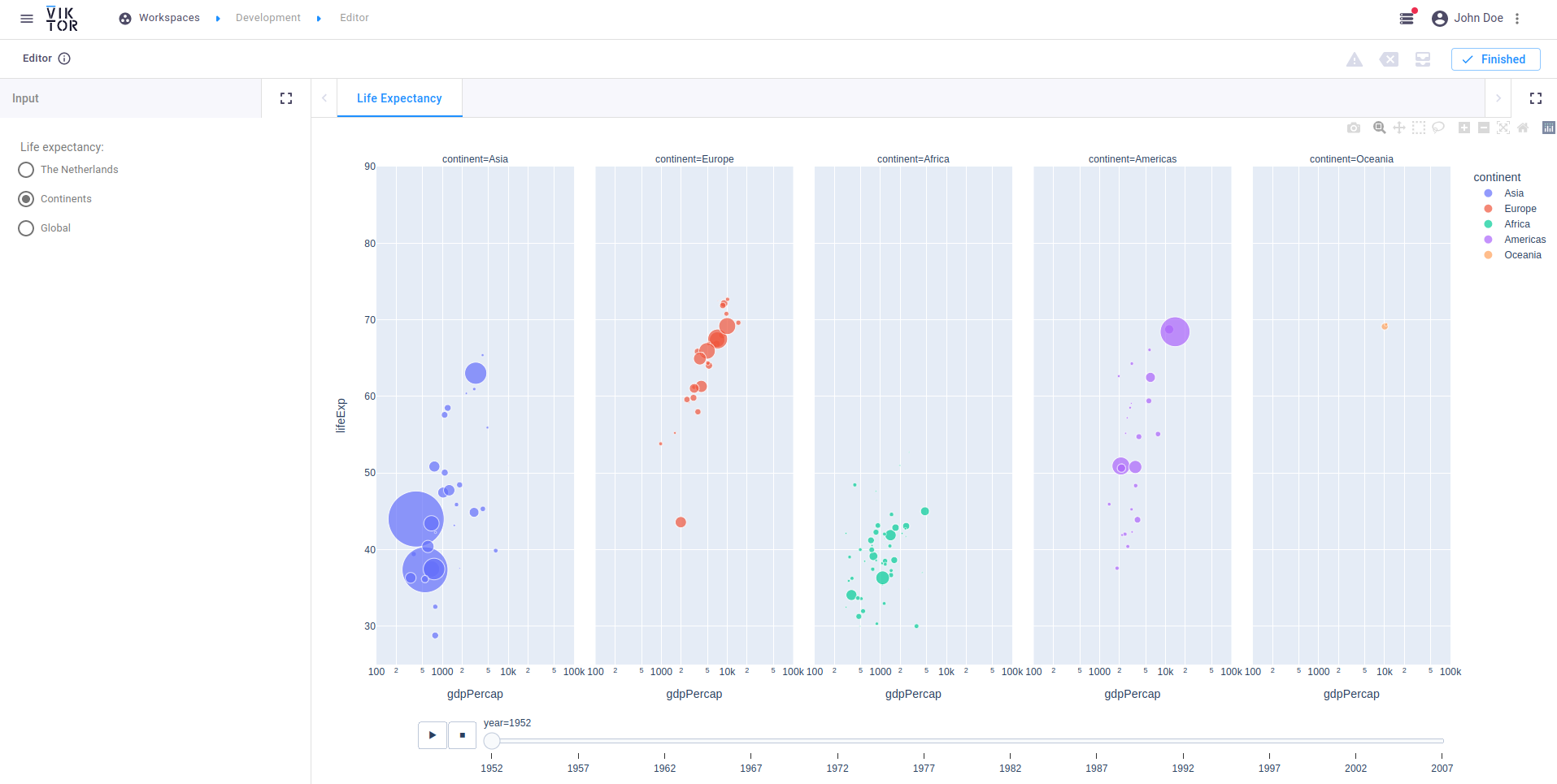
- animated scatter plot per continent
- world map surface plot
The end result can be downloaded here.
For more examples of applications, please visit the sample apps
Creating an empty app
A template 'editor' type app can be generated using the CLI. We will use this template app as a starting point for the
tutorial. Run the following command (replace editor-tutorial with the folder name of your choice):
viktor-cli create-app --app-type editor editor-tutorial
Folder structure
The app has the following folder structure:
editor-tutorial
├── app.py
├── CHANGELOG.md
├── README.md
├── requirements.txt
├── tests
│   └── __init__.py
└── viktor.config.toml
Note that the app type ('editor') has been defined in viktor.config.toml:
Dependencies
Navigate to the newly created folder and open requirements.txt and add plotly as additional requirement. We will
use this package to create the (interactive) visualizations.
viktor==X.X.X
plotly
Installation
Now run the clean-start command from within the folder to install the app and its dependencies, and start the app:
viktor-cli clean-start
Login to the app in your browser to verify that the app is installed and running as expected. You will be redirected to the app's editor, which is currently a blank page.
If you see the "Workspaces" menu upon logging in, click the "Open" button on the "Development" workspace. After opening, you will be redirected to the app's editor.
Defining the editor (input / output)
Open app.py and replace it with the following code:
from viktor import ViktorController
from viktor.parametrization import ViktorParametrization, OptionField
from viktor.views import PlotlyView, PlotlyResult

import plotly.express as px


class Parametrization(ViktorParametrization):
    _options = ["The Netherlands", "Continents", "Global"]
    graph = OptionField("Life expectancy:", options=_options, default="Continents", variant="radio", flex=100)


class Controller(ViktorController):
    label = 'My Entity Type'
    parametrization = Parametrization(width=20)

    @PlotlyView("Life Expectancy", duration_guess=3)
    def plotly_view(self, params, **kwargs):
        dataframe = px.data.gapminder()
        if params.graph == 'The Netherlands':
            data = dataframe.query("country == 'Netherlands' ")
            fig = px.bar(data, x='year', y='pop', color='lifeExp')
        elif params.graph == 'Continents':
            fig = px.scatter(dataframe, x="gdpPercap", y="lifeExp", animation_frame="year", animation_group="country",
                             size="pop", color="continent", hover_name="country", facet_col="continent",
                             log_x=True, size_max=75, range_x=[100, 100000], range_y=[25, 90])
        elif params.graph == 'Global':
            fig = px.choropleth(dataframe, locations='iso_alpha', color='lifeExp', hover_name='country',
                                animation_frame='year', color_continuous_scale=px.colors.sequential.Plasma,
                                projection='natural earth')
        else:
            raise NotImplementedError
        return PlotlyResult(fig.to_json())
In your browser, refresh the page to reload the editor. On the left side, you will now see radio buttons with the defined options. Go ahead and select another option and see how it influences the results on the right-hand side.